Colour, material and finish
Use approved references and clear names to explain visual differences.
Give every option a clear result. Help customers compare possibilities and discover a combination that feels right. Keep each choice and its visible result together before an enquiry or purchase.
Try the illustrative image colours. A working configurator uses the actual product variants and valid combinations.
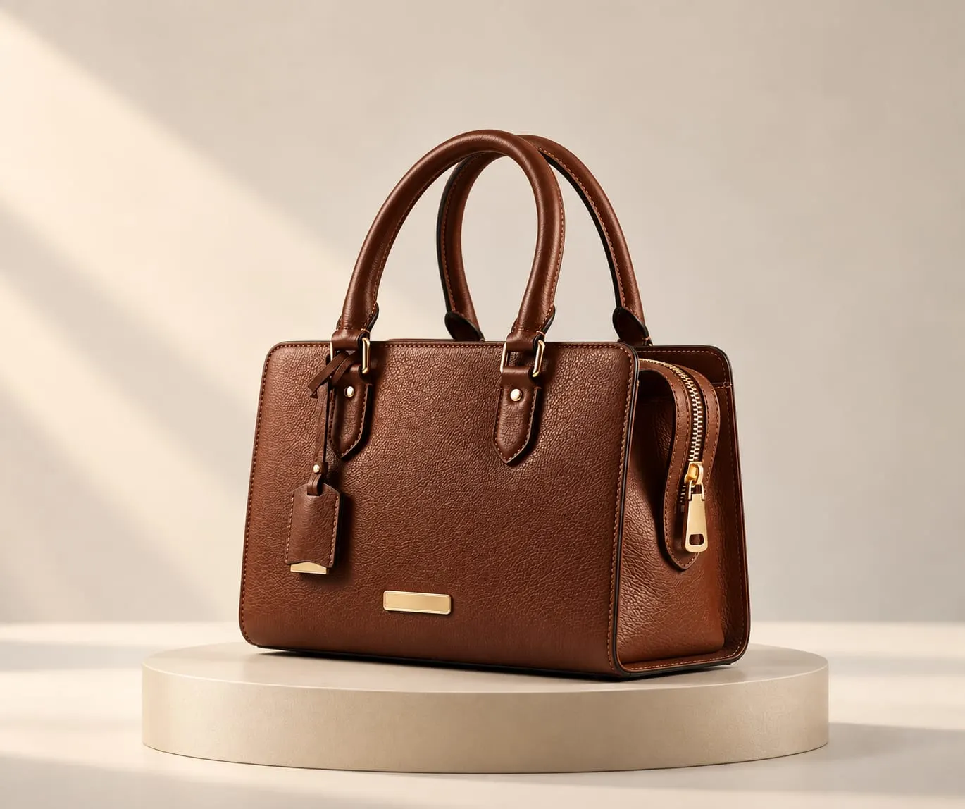 Image preview
Illustrative image colours. Available finishes are defined for each product.
Image-based preview. A working experience will be offered after approval.
Discuss this product experienceA colour changes the character. A material changes the feel. A component changes the whole. Show the effect of a selection in the product itself, so customers can explore with intention.
Explore finishes and combinations for the spaces people live in.
Make exterior choices and supported options easier to compare.
Bring colourways and material combinations into focus.
Explore the details that give an accessory its character.
Consider the elements that define a personal timepiece.
Present considered choices for a distinctive piece.
Explain the relationship between modules, surfaces and finishes.
Use approved references and clear names to explain visual differences.
Show supported parts and the combinations that belong together.
Agree any supported text, trim or other personalisation as part of the product scope.
Compare upholstery, timber finishes and compatible modules in the context of a single design.
Explore colourways and hardware combinations without losing sight of the overall object.
Explain supported component options for vehicles or equipment, with the product rules clearly defined.
Available options and dependencies should reflect the actual range. Confirm dimensional changes, component compatibility and unavailable combinations before publication.
A furniture finish, accessory colourway or vehicle trim needs a different sequence. Keep that sequence focused on what the customer can actually order or discuss.
Views, hotspots, animations and sound explain the product; they do not change its configuration. Colours, materials, finishes and components define the selected product. Saved choices, sharing and quotation summaries can support the next conversation where included.
Checkout, live pricing and availability are separate integration decisions. Agree which system owns each value and how the selected combination reaches it.
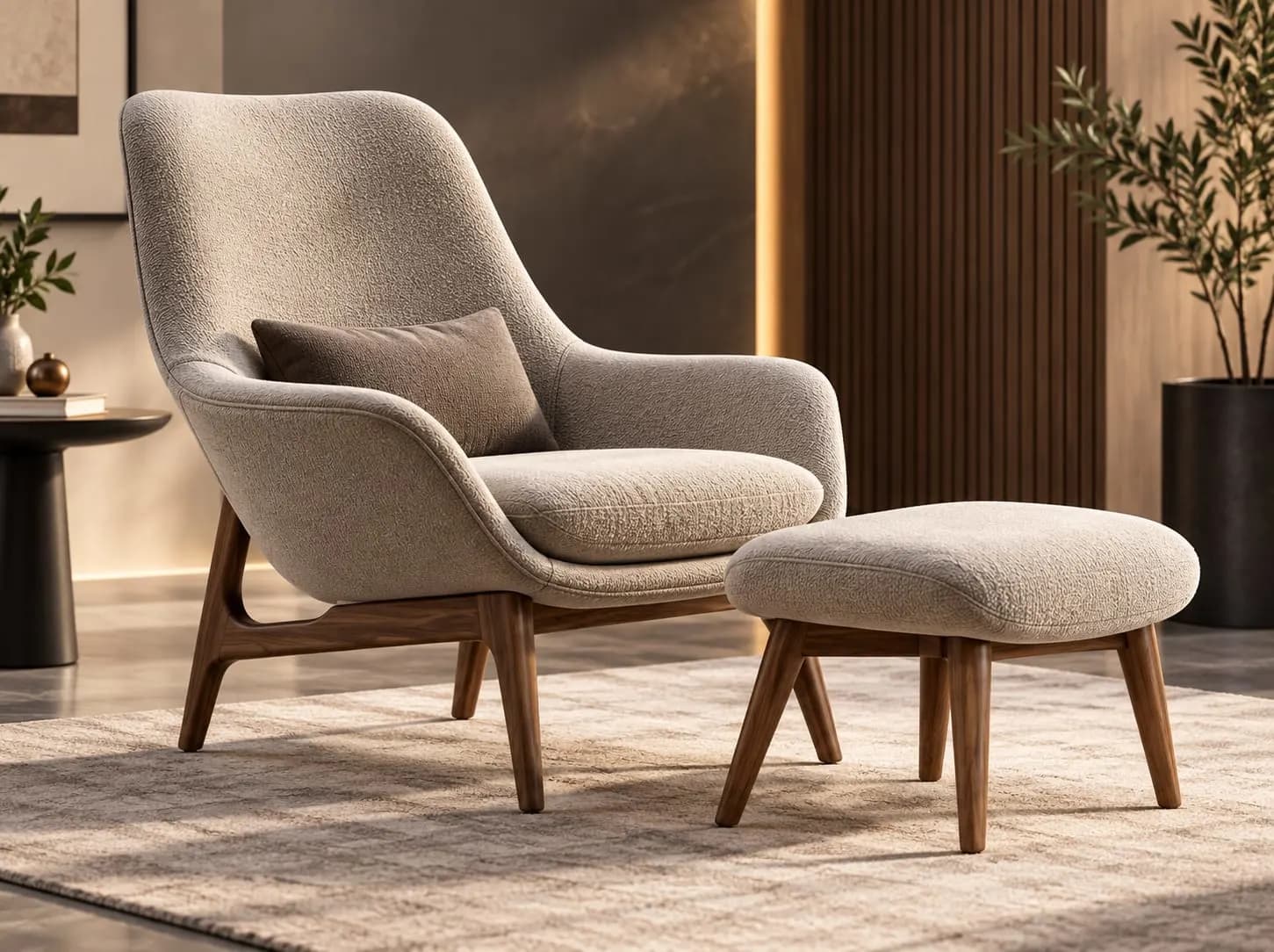

Keep controls readable and touch-friendly, with the selected result close to the choice. Test zoom, orientation and the return to product information on supported devices.
A lightweight image keeps collection pages usable. Load the working configurator after intent unless the dedicated page has been tested for immediate loading.
Gather product references, materials and the choices customers need to understand.
No. It uses illustrative image colours. A working product configurator uses authored visual assets and the actual available choices.
Where the product and experience support them. Define the valid options, constraints and visual states before production.
Not automatically. Pricing, inventory, saving, sharing and checkout depend on the agreed systems and integration.
Explore products interactively in 3D and inspect relevant product detail.
Visualize supported products in real-world environments.
Let customers experience supported products virtually before purchase.
Turn static product catalogues into richer interactive product discovery experiences.
Bring the range, its options and the next step you want customers to take.
Book a Demo